
Ordering a Rivian? Use code JOSE1715716 to earn up to 500 points + 3 months of free RAN charging.
R2 UI Preview Shows Rivian’s Next Gen Design
This is the kind of stuff that gets me way more excited than 0 to 60 times.
Thanks to coverage from outlets like InsideEVs, we’re finally getting a closer look at R2’s updated UI, and honestly, it feels like Rivian just leveled up its entire design language.
What immediately stands out is how much softer and more refined everything looks. The sharp edges are gone. In their place, we’re seeing rounded corners everywhere, floating modal windows that sit centered on the screen, and a completely rethought layout that feels modern without trying too hard. It’s clean.
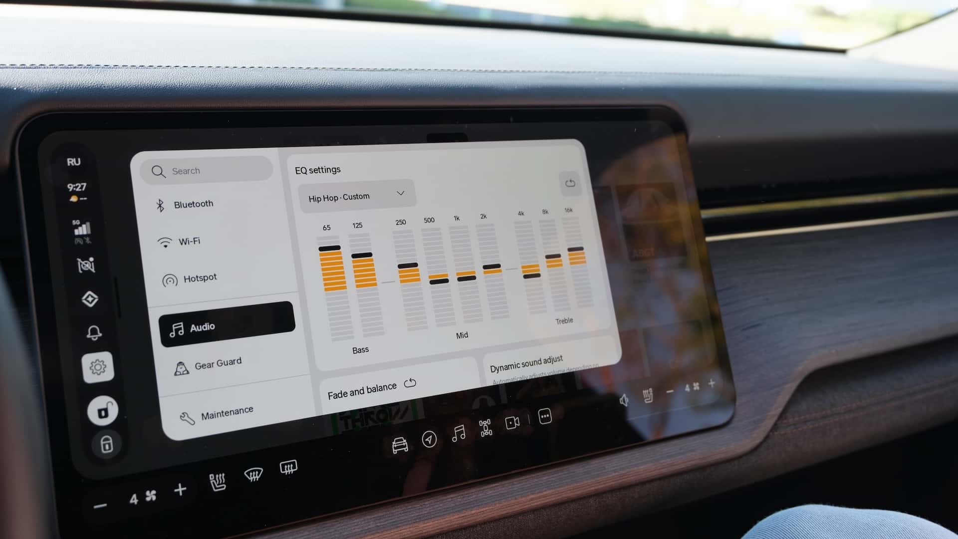
The biggest visual shift is the new left side dock replacing the old top bar. Instead of stretching controls across the top of the screen, Rivian is anchoring key functions in a vertical dock that floats over whatever app or screen you’re using. It has this subtle “Liquid Glass” vibe, almost like it’s hovering above the UI rather than being baked into it. It’s lighter, less intrusive, and way easier on the eyes.
And then there’s something owners have been quietly asking for: the ability to move the media panel. You can now float it on either the left or right side of the screen. That means the driver can keep controls close, or the passenger can take over DJ duty without leaning across the cabin. It’s a small change that feels very human in its thinking.
Menus across the system look simplified and bold. Bigger touch targets. Clearer typography. Less clutter. It feels like Rivian stepped back and asked, “How do we make this intuitive at a glance?” instead of cramming more into every corner.
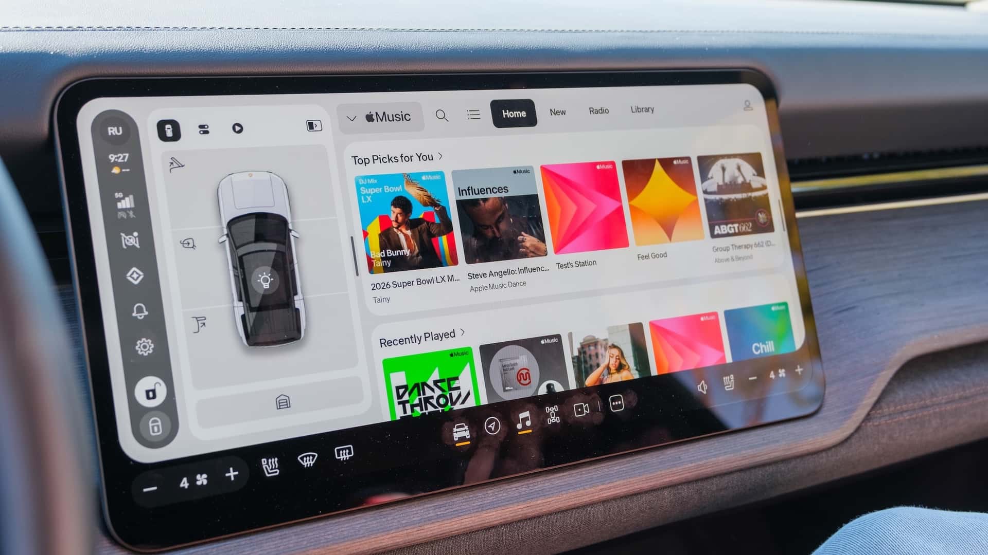
The Music app got a full redesign too. It now matches the refreshed UI language, and from what we’ve seen, it looks far more cohesive with the rest of the system. No more feeling like one app is living in a slightly different design era than the rest of the vehicle.
On the driver display, there’s a functional upgrade that might be even more important than the visuals. Drivers can now adjust temperature and fan speed directly from the steering wheel. No digging into menus. No reaching for the center screen. Just quick, tactile control while keeping both hands where they should be. That’s the kind of usability improvement that actually matters in day to day driving.
What I love most about all of this is the direction. Rivian’s new UI feels lighter, more refined, and more premium. It’s not flashy for the sake of being flashy. It feels thoughtful.
And if history tells us anything, these changes won’t stay exclusive to R2 for long. Rivian has consistently pushed meaningful software improvements down to R1, and I fully expect this refreshed interface to make its way there too.
If this is the visual and functional direction Rivian is heading with R2, we’re in for something special. This is a company maturing its design language in real time, and I’m here for it.
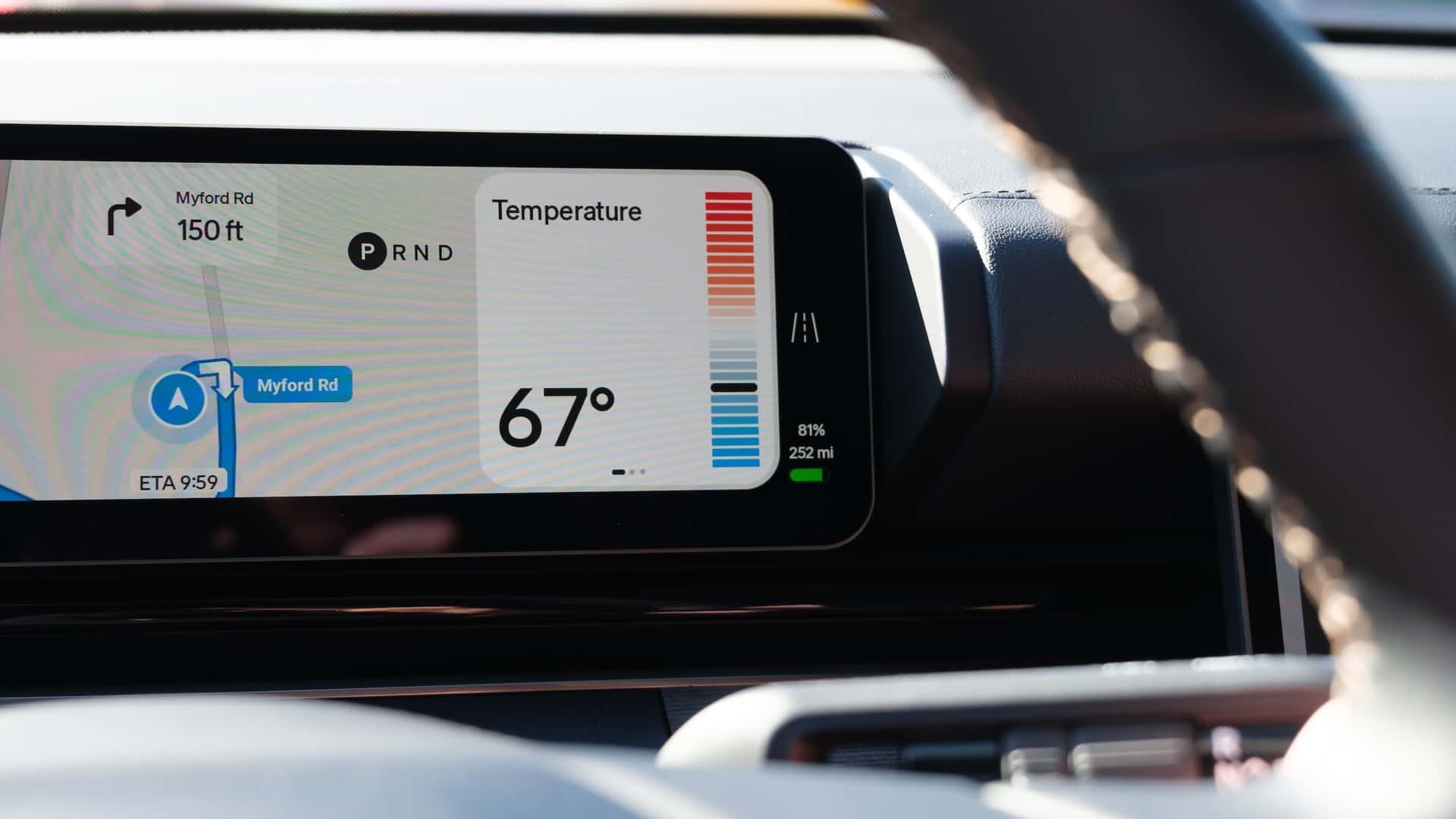
If you look closely at the time of day , you can see the current weather in a widget with it, similar to the R2/R3 reveal where the clock and weather were displayed in the center of the main screen. That’ll be nice, especially if it has current conditions/forecast data for your given area.
Thanks for today’s posts Jose! R2 looking good! So if 81% SOC equals 252, does that mean 100% SOC is 311.11 miles on the model shown? (Solve .81(x)=252mi
If you do a little math, the 100% range for that R2 would be 311 miles in All-Purpose. Of course this depends on an unknown wheel, battery and motor setup, but it’s a data point.
Jose, do you believe they will rework the R1 UI to conform it (as much as possible) to the R2 UI? Also, what about messaging? BTW, I really love your reporting and in the 7 months since I leased my R1T Gen 2, your coverage has gotten so much better, brighter and informed. Thank you.
YT
Yes! Wassym actually commented this morning on my social post and said it’ll be coming to R1 later this year.
That Rivian Logo on the “fish stick” bar. Is that the My guess is “Hey Rivian.” Gotta be, right?